How long has it been since we have released new features on the console? Some of you might say quite a while and they would be right! That’s because – besides the usual small changes, tweaks and fixes – we’ve been working on more visible things as of late which we are proudly introducing to you now!. Behold! The new Clever Cloud console is here.
So, we decided to make some special resolutions for 2018 that we’ve successfully realized.
The starting point was quite simple: how can we give more insight on the state of the apps? What kind of visual cues could we bring to the list of apps?
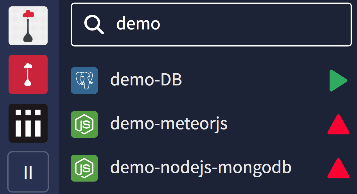
First, the new status icons
More than a UX effort, we’ve made some substancial changes to our API, in order to make the state of the app crystal clear at a glance. To that end, a new set of icons have been designed to summerize the many different states of an app:

So in this new design, in the application list, you’ll find a status icon binded to it. Also, if you named your app and its DB/add-ons with similar names, they will be displayed close to each other 🙂

A new filter field
That is one of my favourites. You already have a search to jump to a specific organization or app/add-on (try it by typing “/” in the console). But now, when you are in an organization, you can filter your app and add-ons by name.
This filter is stored locally for each organization. If you named your apps and add-ons the right way, you can keep a filter and only see your dev & prod apps and the linked addons, for example.

Then, the new app overview
That’s all for the organization part. Let’s speak about the apps now. We have a new refreshed banner at the top of each application’s Overview. The first part is about the action you can take on the app lifecyle (stop, restart), and the other blocks are informations about the app. Let’s see what we have in detail:
- We are now displaying current status, with some additional details on it (git commit, etc.)
- The runtime of the app is now clearly displayed with an icon
Also:
- The instances list (reusing the new status icon) is visually optimized
- The scalability settings (read-only) are now shown
- And we’ve added info about the two last deployments

Oooh, I log you so 🎶
The news gets better: logs have been updated too. The main idea was to give users a better understanding of what’s deploying, and what’s the state of each instances. The new dropdowns to select instances are now simpler. Also, we’ve switched from websocket to SSE for more reliability of connections between your browser and our logs API. That means less reconnections hiccups =)
Let’s wrap-up
What about some moar
We’ve not listed here everything, some details that don’t need an explaination are missing. Like theses:
- Global create button on top (new apps/addons panel)
- Variant/runtime icon next to the app (new apps/addons panel)
- Refreshed icons/shape for app creation
- Refreshed icons/shape for addon creation
A future moving forward
The console is still under active development. You might notice tiny changes and updates in the next few days. But the navigation and other parts of the UI are also currently being improved, to meet the standards of quality we want to achieve, so stay tuned =)
Have some thoughts about this new Clever Cloud console?


